by Merijke Coenraad
This post will focus on Trends at NSF and Beyond: Data Science.
No matter what subject you teach, it is likely that data comes into play in your classroom. Whether it is statistical analysis of data in math, collecting and analyzing data in science, or analyzing historical and contemporary data to understand the present, data can be found in many classroom activities. A trend within CIRCL projects was harnessing the data revolution. With more and more data collected each day and the accessibility of data for you and your students, there are many ways you can learn from these projects and bring them into play within your classroom. For example, check out these two projects: STEM Literacy through Infographics and Data Clubs.
STEM Literacy Through Infographics
Created by a team of researchers from across the US, STEM Literacy Through Infographics focuses on helping students create infographics in both classroom and out of school settings to help students make visual, argumentative claims (watch a 3-minute video about the project). The project aims to provide students with the skills they need to ask and answer questions about their own lives and communicate that data to others through data journalism. This ambitious project brings together experts in educational technology, mathematics, and learning and mashes up data science, data visualization, and citizen science opportunities to help students make sense of the data that is available to them. If you’re interested, you can try out infographics in your classroom using their helpful step by step guide “How to Make Infographics”, classroom lesson plans and resources, and asynchronous professional development workshop.
Data Clubs
Data Clubs are designed by a team of researchers at TERC and SCIEDS to provide middle school students with data skills that allow them to visualize and analyze data about life-relevant topics. Within the lessons, students write their own questions, collect their own data, and learn how to represent their data by hand and using computer software. This ongoing ambitious project uses design-based research collecting data about students’ data dispositions and interviewing them about their experiences. It mashes up mathematics, informal learning, data visualization, and statistics to help students think about the who, when where, how, and why of data. Try out the currently available modules with your students!
These projects demonstrate the importance of quality data experiences for students and the role that data visualization can play in students learning from the large data sets that are available to them. Besides trying out materials from these projects, how can you use data science in your classroom? Here are some ideas:
- Explore infographics on Information is Beautiful and have students create their own by hand (as seen in Dear Data) or using a computer program.
- Engage students with visualization of climate change on Climate.org run by NOAA. The platform provides a number of data visualization environments in which students can explore climate data.
- Explore the Johns Hopkins US or World Coronavirus maps to discuss current trends (click on counties to see more specific data)
- Explore data visualization of the 2020 election from Statista or CISA to discuss trends in voting and the role that data visualizations play in data communication (consider showing this clip of CNN analyzers using live data visualizations to discuss visualizations in election reporting)
- Allow students to use data from Our World in Data and/or the CODAP platform to explore data and create their own visualizations
- Lead students in a discussion about data collection in their lives and the amount of data collected from their use of social media, online shopping, and other internet-connected activities. Provide students with the opportunity to critically analyze how companies are making money off of their data collection and what they could do to advocate for and protect themselves from harmful data use.
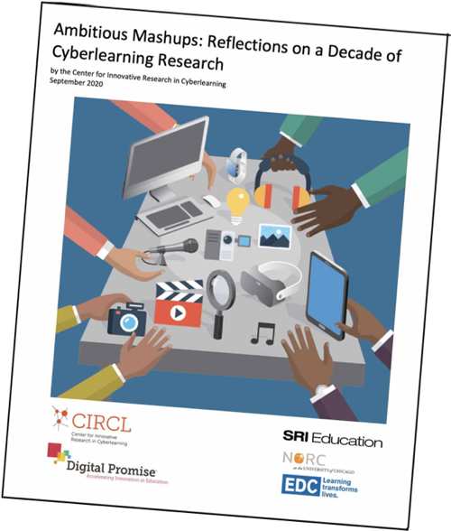
How do you use data in your classroom? Tweet us @EducatorCIRCLS and tell us about your innovative technology use and stay tuned for future blogs in this series about CIRCL Ambitious Mashups.
Educator CIRCLS posts are licensed under a Creative Commons Attribution 4.0 International License. If you use content from this site, please cite the post and consider adding: “Used under a Creative Commons Attribution 4.0 International License (http://creativecommons.org/licenses/by/4.0/).”
Suggested citation format: [Authors] ([Year]). [Title]. Educator CIRCLS Blog. Retrieved from [URL]


 Download the Report (PDF)